4th Flashcards
(27 cards)
Query results
df.query(‘statement’)
ex.
stocks. query(‘price >= 90’)
stocks. query((‘stock == “disney” or (stock == “nike” and price < 90’))
Reshape data from wide to long
df.melt(id_vars = [‘c’, ‘c1’]), value_vars = [‘val’, ‘val1’], var_name = [‘var_name’], value_name = ‘val_name’)
id_vars: columsn not to change
value_vars = the values columns to keep
value_name = the name of the value column
ex

Set up MatPlotLib
import matplotlib.pyplot as plt
fig, ax = plt.subplots()
plt.show()
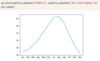
Single line plot Matplotlib
import matplotlib.pyplot as plt
fig, ax = plt.subplots()
ax. plot(df[‘x’], df[‘y’])
plt. show()
Multiple line plots on a single Matplotlib
import matplotlib.pyplot as plt
fig, ax = plt.subplots()
ax. plt(df[‘x’], df[‘y’])
ax. plt(df1[‘x’], df1[‘y’])
plt. show()

Add marker to line plot in Matplotlib
import matplotlib.pyplot as plt
fig, ax = plt.subplots()
ax. plot(df[‘x’], df[‘y’], marker = ‘o’)
plt. show()
Change linestyle to dashed Matplotlib
import matplotlib.pyplot as plt
fig, ax = plt.subplots()
ax. plot(df[‘x’], df[‘y’], marker = ‘v’, linestyle = ‘–’)
plt. show()
Choose color in Matplotlib
import matplotlib.pyplot as plt
ax, fig = plt.subplots()
ax.plot(df[‘x’], df[‘y’], color = ‘r’)

Customize axes labels Matplotlib
ax. set_xlabel(‘x label’)
ax. set_ylabel(‘y label’)
plt. show()
Add title Matplotlib
ax. set_title(‘title’)
plt. show()
Create multiple rows/columns Matplotlib
import matplotlib.pyplot as plt
ax, fig = plt.subplots(3, 2)
plt.show()
(# of row, # of col)
Add graph to a multiple row/col Matplotlib
import matplotlib.pyplot as plt
ax, fig = plt.subplots(3, 2)
ax[0, 0].plot(df[‘x’], df[‘y’], color = ‘b’)
plt.show()
Plot multiple lines (avg, max) on multiple graphs (df, df1) in Matplotlib
import matplotlib.pyploy as plt
fig, ax = plt.subplots(2, 1)
ax[0].plt(df[‘x’], df[‘avg_y’], color = ‘b’)
ax[0].plt(df[‘x’], df[‘max_y’], linestyle = ‘–’, color = ‘b’)
ax[1].plt(df[‘x’], df1[‘avg_y’], color = ‘r’)
ax[1].plt(df[‘x’], df1[‘max_y’], linestyle = ‘–’, color = ‘r’)
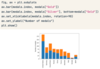
Bar chart in Matplotlib
import matplotlib.pyplot as plt
fig, ax = plt.subplots()
ax. bar(df[‘cat’], df[‘val’])
ax. set_xticklabels(df[‘cat’], rotation = 90)
ax. set_ylabel(‘y label’)
plt. show()
Stacked bar chart with 2 bars in Matplotlib
import matplotlib.pyploy as plt
fig, ax = plt.subplots()
ax. bar(df[‘cat’], df[‘val’])
ax. bar(df[‘cat’], df[‘val2’], bottom = df[‘val’])
ax. set_xticklabels(df[‘cat’], rotation = 90)
ax. set_ylabel(‘y label’)
plt. show()
Stacked barchart 3 bars Matplotlib
import matplotlib.pyplot as plt
fig, ax = plt.subplots()
ax. bar(df[‘cat’], df[‘var1’])
ax. bar(df[‘cat’], df[‘var2’], bottom = df[‘var1’])
ax. bar(df[‘cat’], df[‘var3’], bottom = df[‘var1’] + df[‘var2’])
ax. setxticktablels(df[‘cat’], rotation = 90)
ax. set_ylabel(‘Y Label”)
ax. legend()
plt. show()

Compare between two histograms Matplotlib
import matplotlib.pyplot as plt
fig, ax = plt.subplots()
ax. hist(df[‘col’], label = ‘COL’, bins = #)
ax. hist(df[‘col2’], label = ‘COL2’, bins = #))
ax. set_xlabel(‘XLABEL’)
ax. set_ylabel(‘YLABEL’)
ax. legend()
plt. show()

Compare between two histograms and set bin boundaries in Matplotlib
import matplotlib.pyplot as plt
fig, ax = plt.subplots()
ax. hist(df[‘col’], label = ‘COL’, bins = [#, #, #, #, #, #, #, #, #])
ax. hist(df[‘col2’], label = ‘COL2’, bins = [#, #, #, #, #, #, #, #, #])
ax. set_xlabel(‘XLABEL’)
ax. set_ylabel(‘YLABEL’)
ax. legend()
plt. show()

Compare between two histograms and set it to transparent in Matplotlib
import matplotlib.pyplot as plt
fig, ax = plt.subplots()
ax. hist(df[‘col’], label = ‘COL’, histtype = ‘step)
ax. hist(df[‘col2’], label = ‘COL2’, histtype = ‘step)
ax. set_xlabel(‘XLABEL’)
ax. set_ylabel(‘YLABEL’)
ax. legend()
plt. show()

Adding error bars to line plots in Matplotlib
import matplotlib.pyplot as plt
fig, ax = plt.subplots()
ax. errorbar(df[‘x’], df[‘y’], yerr = df[‘y’])
ax. errorbar(df2[‘x’], df2[‘y’], yerr = df2[‘y’])
ax. set_ylabel(‘YLABEL’)
plt. show()

Boxplots in Matplotlib
import matplotlib.pyplot as plt
fig, ax = plt.subplots()
ax. boxplot([df1[‘val’], df2[‘val’]])
ax. set_xticklabels([‘df val name’, ‘df2 val name’])
ax. set_ylabel(‘y label’)
plt. show()

Scatter plot in matplotlib
import matplotlib.pyplot as plt
fig, ax = plt.subplots()
ax. scatter(df[‘x’], df[‘y’], color = ‘red’, label = ‘c’)
ax. legend()
ax. set_xlabel(‘x label’)
ax. set_ylabel(‘y label’)
plt. show()
Multiple Scatter plots
import matplotlib.pyplot as plt
fig, ax = plt.subplots()
ax. scatter(df[‘x’], df[‘y’], color = ‘red’, label = ‘c’)
ax. scatter(df1[‘x’], df1[‘y’], color = ‘blue’, label = ‘c1’)
ax. legend()
ax. set_xlabel(‘x label’)
ax. set_ylabel(‘y label’)
plt. show()

Saving visualizations Matplotlib
fig.savefig(‘location/file.png’)
