OpenIntro 2 Flashcards
(28 cards)
intensity map
colors are used to show higher and lower values of a variable
contingency table
A data matrix that displays the frequency of some combination of possible responses to multiple variables; cross tabulation results
mosaic plot
uses the area of rectangles to display the relative frequency of occurrence of all combinations of two categorical variables
column proportions
computed as the count divided by the corresponding column total
row proportions
computed as the counts divided by their row totals

Dotplot
En-variabels scatterplot, bruges til at vise tendenser i enkelte variable fra datasæt. Prikkernes gennemsigtighed repræsenterer proportion (hvor mange lånrenter ud af alle er omkring 10%, eksempelvis) under dette er en trekant, der viser gennemsnittet, og under dette, værdier.

stacked dotplot
Som et prikplot, men i stedet for gennemsigtighed som mål for hyppighed stables prikkerne så man får hele tal. Alt andet er ens. Virker naturligvis kun for relativt små datasæt, da man let kan løbe tør for plads.
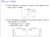
Mean vs median

Median
Mellemste værdi i et SORTERET datasæt. Hvis n / 2 er et heltal (lige antal observationer), er den mellemste værdi gennemsnittet af de to mellemste værdier. Hvis ikke, er antallet ulige, og så vælger man bare den mellemste værdi. Repræsenterer centrum af et datasæt, og er mere robust end gns. (prøv at skrive et monsterstort eller småt tal i dine observationer, og se hvordan gennemsnittet ikke længere er repræsentativt). 50% af data over / større og 50% under / mindre end denne markør.
Q1
Første kvartil (nederste / venstre side af boxplots “krop”) - Repræsenterer at 25% af værdier er under denne.
Remember: 50th interquartile range is the median
Q3
Tredje kvartil (øverste / højre side af boxplots “krop”) - 75% af værdier under denne, eller 25% større end denne markør.
Mean vs median
modality and skewness

Distribution
A function showing all possible values/intervals of the data & how often they occur.
Data Density
The frequency of data at a certain value. Measured in a histogram.
Mode/Unimodal/Bimodal/Multimodal

Deviation
The distance of an observation from its mean.
Standard Deviation
Measures how far the data are spread out from their average value.
Sample Variance
Measures how far the data are spread out from their average value.
How wide is the distribution?
Mode
In statistics, the mode is the one that occurs most.
Unlike the median and the mean, the mode is not necessarily unique. There might be several different values that occur the same number of times.
Bar plot
For showing categorial data
(remember that a barplot can show “counts” or “proportions” in y axis

Comparring nummerical data

Null hypothesis vs alternative hypothesis
“there is nothing going on”

Hypothesis test
Example using 100 simulations of the test, to make sure that there is or not is discrimination. One or two tests would most likely be down to chance alone, therefore you have to make a lot of simulations of the test.
- “There is nothing going on.”
Promotion and gender are independent, no gender
discrimination, observed difference in proportions is simply due
to chance. ! Null hypothesis - “There is something going on.”
Promotion and gender are dependent, there is gender
discrimination, observed difference in proportions is not due to
chance. ! Alternative hypothesis


