What is technical analysis?
Study of collective market sentiment,
expressed in buying and selling of assets;
prices are determined by the interaction of supply and demand
Technical Analysis Summary
1: - Charts
2: - Trends
3: - Price Based Indicators
4: -Non Price Based Indicators
5: -Ellliot Wave Theory
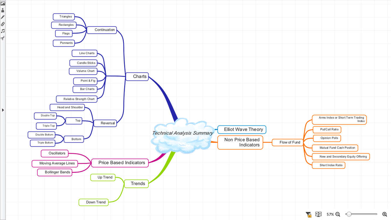
Charts
Low Calorie Rice
Prepared By Variender
1: - Line Charts
2: - Candle Sticks
3: - Volume Chart
4: - Point & Fig
5: - Bar Charts
6: - Relative Strength Chart
Trends
1: - Up-Trend
2: - Down-Trend
Chart Patterns
Reversal and Continuation
1: - Reversal Patterns
a: - Head and Shoulders & Inverse Head and Shoulders
b: - Top
i. Double Top
ii. Triple Top
c: - Bottom
i. Triple Bottom
ii. Triple Bottom
2: - Continuation Patterns
a: - Triangles
b: - Rectangles
c: - Flags
d: - Pennants
Price Based Indicators
**A:- Oscillators **
1: - Rate of Change Oscillators
2: - Relative Strength Index
3: - Moving Average Convergence and Divergence (MACD)
4: - Stochastic Oscillator
* * B:- Moving Average Lines**
C:- Bollinger Bands
Non Price Based Indicators
1: - Arms Index or Short Term Trading Index
2: - Put/Call Ratio
3: - Opinion Polls
4: - Mutual Fund Cash Position
6: -New and Secondary Equity Offering
7: -Short Index Ratio
What does price and volume reflect?
the collective behavior of buyers and sellers
What is the key assumption of TA?
1: -Market prices reflect both rational and irrational investor behavior;
2: - Implies that the efficient markets hypothesis does not hold
What do TAs believe about investor behavior?
it is reflected in trends and patterns that tend to repeat and can be identified and used for forecasting prices
What are two advantages of TA?
1) Actual price and volume data is observable whereas much of fundamental data is subject to assumptions or restatements
2) It can be applied to prices of assets that do not produce future cash flows
If prices have changes exponentially over long periods of time what might an analyst do to his charts?
draw a chart on a logarithmic scale instead of a linear scale
Charts
1: - Line Charts
2: - Candle Sticks
3: - Volume Chart
4: - Point & Fig
5: - Bar Charts
6: - Relative Strength Chart
What are the three main types of charts?
1) line charts
2) bar charts
3) candlestick charts
Candlestick Chart
1: -Bar Chart that draws a box from the opening price to the closing price on the vertical line for each trading period
2: - The box is empty if the close is higher than the open and filled if close is lower than the open
Note:-See where is open and where is close .When the price goes down then the close is below
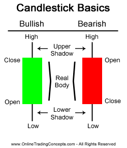
Candlestick Chart
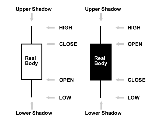
Candlestick Chart
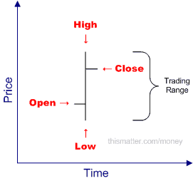
Bar Charts
1: -Vertical lines from the high to low price for each trading period.
2: - A mark on the left side of the line indicates the opening price and a mark on the right side of the vertical line indicates the closing price
Line Charts
Closing prices for each period are connected by a line
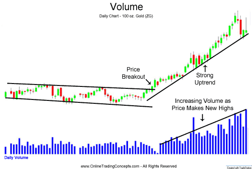
Volume Chart
1: -Vertical line from zero to the number of shares (bonds,contracts) exchanged during each trading period .
2: - Often displayed below a bar or candlestick chart of the same asset over the same range of time.
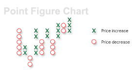
Point and Figure
1: - Displays price tends on a grid
2: -Price is on the vertical axis and each unit on the horizontal axis presents a change in the direction of price trend
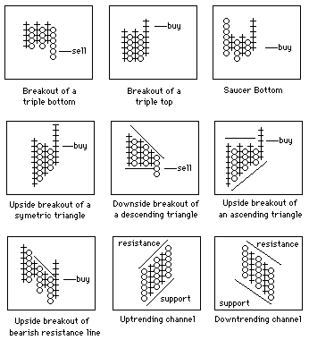
Resistance and Support Levels in Point and Figure Charts
Relative Strength Chart
1: -Line chart of the ratios of closing prices to a benchmark index .
2: -These charts illustrate how one asset or market is performing to another
3: - Relative strength charts are useful for performing inter-market analysis and for identifying attractive asset classes and assets with in each class that are out performing others
What does relative strength mean?
a trend that indicates the asset is outperforming the benchmark


